
Trend Report: Colors of 2020
This year we saw the shock of Living Coral. The year before, it was a pop of Ultra Violet. For 2020, Pantone’s Color of the Year will be...blue. Classic Blue, to be exact. Represented by the numbers 19-4052 in the company’s standardized color system, Classic Blue represents a turn away from shocking shades in favor of the color equivalent of comfort food.
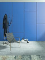
Formica laminate in 914 Marine Blue.
Pantone’s explanation for its choice: Classic Blue instills calm, confidence, connection, "as well as a desire for a dependable and stable foundation on which to build as we enter a new era," the company said in a statement. Leatrice Eiseman, executive director of the Pantone Color Institute, went on to say, "We are living in a time that requires trust and faith. It is this kind of constancy and confidence expressed by Classic Blue."
Like clockwork, everyone jumped on this "new neutral" tone whether through expressing opinion or spotlighting projects that don it. If you’ve heard or read any of the commentary, you’ll start to discern a pattern.

Vola's HV1 faucet in dark blue.
Sue Wadden, director of color marketing at Sherwin-Williams—who, coincidentally, selected Naval blue (SW 6244) as its color of the year back in September—concurs. "We’re on the same page as Pantone for 2020. [Blues] are poised to carry us into the next decade," Wadden says. "Relaxing, assuring shades of navy add a calm confidence to any space of the home."
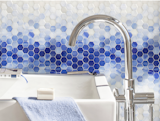
New Ravenna’s Hex Mist water-cut jewel glass mosaic.
Countless other manufacturers and designers have chimed in on this, many using the same language and buzzwords. Tranquility. Calm. Stability. Reliability. Confidence. Wellbeing. Many have also alluded to how we need these now more than ever given the current global climate. No matter where we stand politically, religiously, or culturally, we must admit that in recent years, life has been shocking and sometimes downright disheartening, to say the least. Theories on color psychology suggest that people are therefore looking to the objects, environments, and details that comfort and encourage them—including color.

MasterBrand offers its Omega-brand Renner Shaker cabinetry in maritime, naval, and blueberry.
While Sherwin-Williams chose a comparable blue, Benjamin Moore and Behr went in different directions along the spectrum. The former announced First Light (2102-70), a soft, light, and rosy pink, explaining its choice in a similar fashion: "We selected First Light to represent a new dawn of idealism, design, and living. First Light reflects a new definition of the home, a shift in mindset from the material to satisfying the core needs in life: community, comfort, security, self-expression, authenticity, and ultimately optimism," said Andrea Magno, Benjamin Moore’s director of color marketing and development.
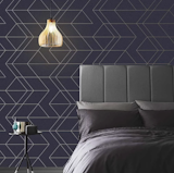
Graham & Brown’s Balance wallpaper in navy and gold sports an attention-grabbing geometric pattern.
In midsummer, the latter brand named its 2020 color Back to Nature (S340-4) which, as its name hints, references nature as a meadow-inspired neutral green. "As we look to a new decade, Back to Nature encourages us to reengage with the natural world, which we know can have a real, positive impact on our wellbeing," stated Erika Woelfel, vice president of color and creative services at Behr. Notice whatever the hue, all share similar descriptions.
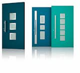
Wisniowski’s Deco doors are aluminum external doors that come in neutral or vibrant RAL powder-coat colors.
So maybe there is a deeper rhyme and reason behind color forecasting in residential design after all. But keep in mind that even though color marketing and theories run rampant, scientific data proving how each color subliminally affects a person is lacking. And, there is always some subjectivity as perceptions and emotions are individual and associations can be colored (no pun intended) by culture and country. White, for instance, represents purity and goodness to most Americans. But in China, it takes on a different meaning: mourning and death! (In fact, in Chinese culture, one is considered to be very unlucky for wearing white in one’s hair when no one has died.) While some people, especially in the western hemisphere, find blue to have a calming effect, others may feel it’s saddening or icy cold. It’s all in your perspective.
Brooklyn-based design journalist Sheila Kim reports on architecture, interiors, and decor, as well as design-centric products that run the gamut from table lamps and home accessories to commercial flooring and acoustic ceilings. Her work has appeared in The Washington Post, Architectural Record, and numerous other publications.
Related Reading:
Two Experts Weigh in on the Best Way to Use Behr’s Color of the Year in Your Kitchen or Bathroom
Your Walls Need to Be Introduced to Benjamin Moore’s Color of the Year
Published
Last Updated
Topics
How-To & GuidesGet the Dwell Newsletter
Be the first to see our latest home tours, design news, and more.