
The History of the Modern Workspace
"Human beings were not meant to sit in little cubicles staring at computer screens all day, filling out useless forms and listening to eight different bosses drone on about mission statements!" Of all the corporate backtalk served up in Office Space, this sentiment may be the one any employee, no matter how much flair, can get behind. Who actually prefers sitting in company-approved shoeboxes? How did we get here?
In fact, as Nikil Saval’s fascinating book Cubed: A Secret History of the Workplace (Doubleday, April 2014) explains and explores, cubicles, and the many iterations of the American workplace over the decades, all sprang from a complex web of social forces, economic fortunes and, yes, even design thinking. From an era where clerks were dismissed as dandies, to a time when Joan Holloway ruled the steno pool, to our brave new world of coworking, workplaces were not merely an afterthought. They could reflect optimistic, almost utopian, views of worker independence and corporate hegemony, or the ruthless and uncertain tides of the modern global economy.
Dwell spoke with Saval about Cubed and the impact of designers like Herman Miller’s Robert Propst and Florence Knoll on the spaces where, for better or worse, we spend most of our time.
Let’s start off talking about Robert Propst, who really helped introduce ideas of high design and ergonomics to the office. He came to Herman Miller in 1958 with a handful of patents and no formal design training, and had a pivotal influence on how offices are designed now with his Action Office plan in 1964.
He and the Knolls both started working with office and space planning when it was new. Propst is a bit of an oblique figure. He’s not really a designer. It’s not that he didn’t know design, of course, he just brought in a lot of other viewpoints. His most positive influence was considering interior space something that could be changed, that it had to be forgiving of changes in the workplace.
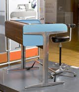
The Roll-Top desk by George Nelson for Herman Miller. This colorful part of the Action Office II system was one of many aspects that was built to adapt to changes in the workplace.
Is it fair to say his ideas of modular office design were the forerunner to the cubicle?
Yeah, and it’s kind of tragic, because his design ideas came from such high-minded ideals.
What were they?
For Action Office I and II, his interest was in flexibility and economy. His focus was on the knowledge worker, and he drew from his own experiences and tested his concepts on himself. He knew there would need to be a variety of spaces for work, with bright displays, openness and variability. This is especially true with Action Office I, which had a standing desk way before a consensus started forming around the idea. For him it wasn’t that you should always stand, it was that you should have the option. That was part of a utopian idea, that you could somehow have the ability to shape your space, have some level of privacy and be in an open environment.
Action Office II, the closest to what we think of as the cubicle today, isn’t meant to be a box. If you look at the angles in the original plans, they were 120 degrees and could be shaped at will for meetings. It’s supposed to accommodate, not determine, what work you would be doing. Propst had the sense that the workplace was changing very quickly, and the only way to adapt to what was going to happen was to have as little design as possible and be accommodating. What he didn’t predict was the personal computer, which was one of the things that put the nail in the coffin.
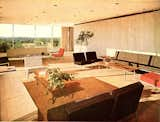
The interior design of the Connecticut General Life Insurance Company’s Bloomfield, Connecticut, headquarters was one of Florence Knoll’s greatest achievements, according to Cubed author Nikil Saval. "It was the peak of a totally organized, thought-through corporate space. It made an insurance company, a paperwork factory, look good, and kept people there."
But Action Office II was still so optimistic. What factors led to others turning his high-minded designs into the soul-crushing cubicle of today?
It’s a complex story. He was saving people from the arbitrariness of what had been rote American office planning up until that point. Europeans called it the American plan; rows of desks, a steno pool, basically the layout we know from The Apartment or Mad Men. The execs had offices around the perimeter. To him, that was antagonistic. It wasn’t how people needed to work. At the time, there was also the open office plan from Germany, Bürolandschaft, that was more open and free flowing, but it lacked articulated space and autonomy.
This is the point where Action Office II came out. But soon after it came out, there was the copycat affect. Steelcase replicated the idea without the high-minded ideals behind it. There was a change in the tax code, which made it cheaper to have an Action Office setup than a private office. So a lot of companies started buying the system en masse, without paying attention to Propst’s ideals. They just wanted to cram people together. What really made the cubicle the symbol of workplace ennui was the economy. It changed the workplace altogether. The series of crises the economy suffered in the ’70s, mergers and acquisitions, leveraged buyouts, it all meant the workplace was much more chaotic, precarious and arbitrary. The cubicle became the symbol of impermanence, not autonomy. I think that’s what led to the Dilbert and Office Space critique of cubicle.
How would you put the Knolls’ contributions into perspective, because they really seemed like the ones who pushed ideas of high-minded design and space planning?
The Knolls were really part of a movement in the ’40s, ’50s, and ’60s to import chiefly European designs into a mass-manufacturing context in the United States. Florence Knoll in particular made the design of the office as integral as the building envelope, which was primarily the job of male designers. She used techniques that came out of fashion, like paste-ups. She made people think about space in an integrated fashion. The CBS Building or Connecticut General, these were interiors that were organized in a deep sense, which contributed to the sense of a corporation being organized. These were real innovations, making in an aesthetic project where the Barcelona chair or Womb chair would fit in. She made the corporation kind of cool.
Did you ever get a sense that any of these designers had reservations about working for corporations?
With Propst, there’s a bit of ruefulness at the end. He sort of admits that he underestimated, to a degree, how capricious the management and executives of a corporation would be. He assumed a certain sort of enlightened idea. I think Propst himself did not quite know what was going to happen with corporate ethos, didn't understand how disinterested they would be in the actual workers.
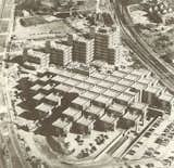
Saval says the design of the Central Beheer Office by Herman Hertzberger was one of the great open office plans of Europe, which differed markedly from American interior designs. "It’s like a casbah, a lot of nested, private spaces."
You also explain how the American and European offices went down a bifurcated path. European offices developed with a focus on more and more privacy. Can you point to some of those European design ideas and designers?
The divergence is interesting, because it comes from the power and tradition of social democracy in Europe, with lots of industrial and white collar workers organizing. They even fought a design element. One of the revolts was against the open office plan. The idea took hold in London and the United Kingdom to some degree, but not in Northern and Southern Europe, where the workers had so much more of a say in how their offices were designed. The greatest of these open office places was Herman Hertzberger’s Central Beheer office in the Netherlands. It’s like a casbah, a lot of nested, private spaces. They’re permanent, made of concrete. They’re meant to be personalized like the Action Office plan, but not totally private. That to me was a compromise between open and private.
The Scandinavian Airlines Building in Stockholm, designed by Niels Torp in the ’80s, has a "street" running through the center of the building with private offices branching off. The urban paradigm didn’t work as well then, but it was very influential later. There were also other factors that made Europe different. There were a lot more owner-operated buildings, so there wasn’t as much speculative development, the huge, massive air-conditioned spaces we have in the United States. They also had regulations about things like what kind of light you should get in an office. There was a lot more pressure on European companies to be better.
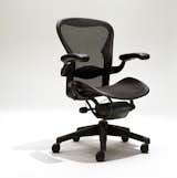
Saval says the Herman Miller Aeron chair was originally created for residents of nursing homes who spent too much of the day sitting down. "Bill Stumpf, a great designer at Herman Miller, came up with a chair that was way too futuristic for a nursing home, but it ended up being incredibly functional for dot-com workers, who would also be sitting for really long hours."
Another fact I found fascinating was that the Aeron Chair, this symbol of high-tech offices, was actually first developed for nursing homes.
As I understand it, they were designing something for people who were sitting for a long time in nursing homes. They had been sitting on La-Z-Boys, which were actually really bad for you. Bill Stumpf, a great designer at Herman Miller, came up with a chair that was way too futuristic for a nursing home, but it ended up being incredibly functional for dot-com workers, who would also be sitting for really long hours. It was probably the most significant chair design of the last 30 years. Now the irony, going back to Propst, is that you shouldn’t be sitting for that long.
That feeds into the idea of coworking spots and open workspaces. We’re living in this era where there’s a lot of experimentation on that front. What do you see as the future for workspace design?
The experimentation has a kind of dark side to it. The cubicle reflects a kind of arbitrary and capricious and precarious work situation. The rise of coworking is interesting. It’s funny, you don’t have to work in an office anymore, but people seek this out. I feel it should be a more fascinating and shocking thing, that people are paying for office space. It shows one of the essentials of office life, that it’s social and cultural and building relationships.
Are there particular designers or interior decorators who are doing interesting projects?
I think there is interesting work being done. Herman Miller is revisiting the concepts of Propst. They have a new system called Living Office that incorporates flexible, forgivable design, adapting to a rapidly changing work environment. When it comes to coworking spaces, there’s a high level of nonprofessionalism of design. We may be returning to a moment with design that’s very demure, if that makes sense. There’s a lot of ad hoc stuff going on. There’s a high demand for workspaces to deliver something because it’s not necessary that you work there. Maybe you need a type of office design that isn’t that obtrusive. It’s a reflection of a workspace where the labor contract has really frayed.
Buy the book

This article was originally published on April 21, 2014. It has been updated to include current information.
Related Reading:
Architecture Critic Nikil Saval Joins the Pennsylvania State Senate in a Time of Crisis
Published
Last Updated
Topics
Workplace & OfficeGet the Dwell Newsletter
Be the first to see our latest home tours, design news, and more.