Standing Room Only: The Vignelli Subway Map
In a panel led by the MTA’s Director of Marketing & Communications Mark Heavey, Yoshi Waterhouse of Vignelli Associates, Peter Lloyd, co-author of "Vignelli: Transit Maps," and Massimo Vignelli, came together to discuss "Vignelli Subway Map: A Story of Birth, Death and Rebirth." Over 30 years after the subway map he designed for the MTA was replaced with a more geographically accurate version, the legendary designer still staunchly defends his 1972 map. But first, to understand the reason for his redesign, one must look at the subway maps of yore. A congested tangle of lines, the predecessor to his ’72 version, tried to make sense of 3 independent subway transit companies lines, while providing bus information and showing the relation of stops to significant city streets.

A talk about the history of Vignelil’s subway map, appropriately held in a former train station. Vintage signs from the old independent systems adorn the walls. Photo provided by the New York Transit Museum.
Having already designed graphics and signage for the subway system, Vignelli was a natural choice for the map redesign. (Thanks to the saints at Pentagram, you can now peruse the New York City Transit Authority’s Graphics Standards Manual online!) A somewhat recent transplant to the city from Milan, he eagerly took on the task as he found the NYC subway system "the best in the world, but at the time the maps were the lousiest." He was commissioned with streamlining the mess to make the map more readable for commuters—and he did. Ridding the map of numerous boxes with extraneous information that caused fragmentation, he reallocated this information to a street map on the reverse side. Anybody familiar with Vignelli’s process knows his projects begin with a grid, not dissimilar to the street system of New York. However, in the case of his subway map, the two grids weren’t easily merged. It was necessary for his grid to shun geography for simplicity, favoring 45 and 90-degree angles.
Yoshi Waterhouse explained to the audience that finding solutions for congested areas of the diagram was sometimes done best by hand. Photo provided by the New York Transit Museum.
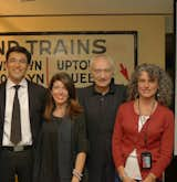
Vignelli Associates Yoshi Waterhouse and Beatriz Cifuentes, Massimo Vignelli, and Gabrielle Shubert, NYTM Director. Photo provided by the New York Transit Museum.
Though he delivered a very clear diagram, New Yorkers who had trouble reconciling the gridded pattern of streets above ground with the geographically inaccurate diagram cried foul. With 7th Avenue located west of 8th Avenue and a squashed version of Central Park (that Vignelli included against his will), many felt the map wouldn’t do. The MTA marketing department formed a committee and when the city was granted $3 million dollars to update the subway system, it was decided a new map would be designed. (Interestingly, a member of this committee was in attendance and brought up a noteworthy point—during this time period the subway was considered dangerous—seemingly small things such as the presence of a park on the map may make them feel safer and more likely to take public transportation to certain locations.)
![Speaking of modernism, Vignelli states "[it] isn’t a style, it’s an attitude, a way of thinking." We tend to agree. Photo provided by the New York Transit Museum.](https://images2.dwell.com/photos/6063391372700811264/6133541215414235136/original.jpg?auto=format&q=35&w=160)
Speaking of modernism, Vignelli states "[it] isn’t a style, it’s an attitude, a way of thinking." We tend to agree. Photo provided by the New York Transit Museum.
But Massimo Vignelli got his just deserts—and in 2008, his map was resurrected for use with the MTA’s digital map, The Weekender. To wrap his head around this new use of his diagram, Vignelli a self-proclaimed "BC (before computer) guy" tapped colleague Yoshi Waterhouse. Consisting solely of geometric lines (versus the curves of today’s map), the diagram is more easily translated to coding for a digital format. And because changing the map is merely a matter of adjusting data, construction notices and station closures can be relayed to users within a matter of seconds. Lines with interruption blink to warn users their chosen route may be out of service, at least "complementing frustration with visual happiness," according to Vignelli.
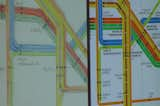
It’s hard to make sense of this early subway map. Photo provided by the New York Transit Museum.
In the future, it is likely the Weekender app will expand to show service disruption 7 days a week, though it is unclear when. Vignelli conveyed hopes that the app would be available on large touch screens in station, allowing subway users to plan their routes with ease and immediately see a bird’s eye view of all current line disruptions. If enacted, tourists and residents may conquer the NYC subway system with less hiccups. But any New Yorker worth his grain in salt doesn’t really need a map, does he?

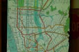
The 1972 Vignelli map. Provided by the New York Transit Museum.
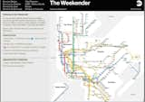
The Vignelli map reincarnated. The Weekender app for iPhone and Droid also lives online. Provided by the New York Transit Museum.
Published
Last Updated
Get the Dwell Newsletter
Be the first to see our latest home tours, design news, and more.