Roger Federer's Personal Logo?

There's that logo on Fed's cap.
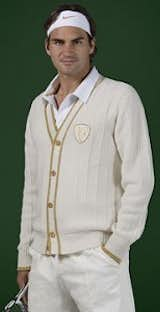
Roger Federer wore this handsome cardigan at Wimbledon 2008, where he took second place.
I personally think it looks like the logo for a line of expensive, plus-size swimwear, with it's dramatic, swooping serifs and obscured elements of the R and the F. And if Nike, his sportswear sponsor, was going for the tennis equivalent of their iconic Jumpman, they've sprayed that volley well wide.
In 2009 I made a wonderful design tour of Switzerland and decided to poll a couple of my design-minded tourmates to see what they make of Fed's insignia. None of them seems to think it's one for the ages, though there's quite a bit of good criticism here and one merciless takedown.
Maria Habib is the director of design and teaches graphic design at the Corcoran College of Art and Design in Washington DC.
There is some debate on whether this concept of personal flourish is tasteful or not, but that aside, I’m not sure what the concept behind this RF is and it’s not clear.
With no stems and no integrating element from the R to the F (for example the blunt way stems of the serifs of the F end) it just seems like floating discombobulated shapes that don’t really relate. It could simply be the negative space treatment that has been poorly executed in this case. Especially in outline form on the T-shirt! That version of the monogram should not exist. The typeface chosen and the thicks and thins of the serifs with not enough consideration for the negative space and link between the two letters just makes this a bit of a stretch.
Lukas Scherrer is the principle of the San Francisco-based design firm Shibuleru. He is originally from Zurich.
It looks like this is one of those icon designs where success (and with that, sponsoring contracts) came very quickly. By that, there wasn't enough time for a designer to play and systematically map out proper possibilities. Because of that, a first-shot design had to be used and once out on the marked, fueled by the athletic success, the icon was accepted and couldn't be changed anymore.
It looks like the current icon is inspired by decorative hip-hop visuals. It has some 'hidden' qualities though; the serifs of the F are pulled off the main body of the R (If you would push them back, you would create a block) and this could be read as some dynamic movement like the swing motion of a racket.
Verdict: Probably a good graphic designer (that likes hip hop) that had to deliver a first shot design given the business context/time to market. One more case where more time would have allowed for a solid long lasting (truly iconic) design.
Jill Singer is a former editor of ID Magazine and the co-founder of the website Sight Unseen.
There are lots of things that confuse me about this logo. One: This might just be my sports ignorance, but does an athlete need a logo? Is this for Federer to wear while he's playing? To remind people of who he is? To remind himself?
Two: That fancy serif seems snooty and aloof, which doesn't exactly help Federer's reputation. Although Federer is basically the sporting equivalent of an Hermes bag, so maybe it's appropriate.
Three, and most important: Removed from the context of Federer actually wearing it, it's kind of illegible and looks weirdly like a de-anthropomorphized Peugeot lion, no?
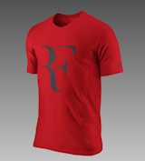
You can get this tee, with the Federer logo, on Nike's website right now. I even think it's on sale.
Simon Johnston is a graphic designer and teacher at Art Center College of Design in Pasadena, California.
Looks like an accident in a sign factory or perhaps a symbol for dyslexia in Armenian script. Sorry Roger, but this is a double fault. "RF" here is Really Feeble. Grade: F.
Published
Last Updated
Get the Dwell Newsletter
Be the first to see our latest home tours, design news, and more.