These Are the Cabinetry Colors to Look Out for in 2020
At the start of a new year—and, perhaps more importantly, a new decade—it can be liberating to try something new. This may be as significant as starting a new career or heading out on a long-awaited trip. It could also be as small as ordering a different dish on a beloved menu or buying an ordinarily "off-limits" outfit. In design, this fresh perspective is often thought about in colors. And in an era when shades of white still reign supreme, there can be nothing more exhilarating than going bold.
"Free yourself from the fear of being bold," says Jordan Cluroe, co-creator of 2LG Studio with Russell Whitehead. As authors of the forthcoming book Making Living Lovely: Free Your Home with Creative Design, Cluroe and Whitehead have long embraced using color as an expression of self.
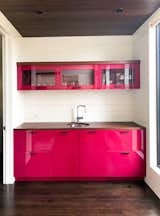
"Longevity comes when you build authentic color stories that mean something to you," Whitehead adds. "A pink kitchen may feel like a bold move, but because it is a color we have loved for many years, that's not going to change anytime soon. Think about what feels natural to you, what makes you happy, and use it as inspiration for your home."
Kate Newman, owner and principal designer of her namesake brand, agrees. "I don't think there are any rules when selecting colors for cabinetry," she says. "But if you are choosing a bolder shade, then it's a good idea to opt for more subtlety on the counter and backsplash."
If colorful cabinetry sounds like the ideal way to start anew, then follow along as these three designers share the shades they think will turn heads in 2020. And to make sure that you have everything you need, they've also included the finishes they prefer and the materials they'd choose to accompany the coats. Read on to get their tips.
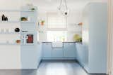
Still want a white kitchen but with an edge? Newman suggests this small-space example as inspiration for a true pop of color. "I don't think there are any rules when selecting colors for cabinetry," she says.
Which colors are you most excited to see on cabinets this year?
Newman: I'm excited to see Benjamin Moore's "First Light" in a pantry or master bathroom. Besides that color, my team and I are choosing different shades of green for kitchen cabinetry. We're into "Caldwell Green" for a more modern feel, and "Vapor Trails"—both from Benjamin Moore—for a classic look.
Cluroe: We're also into green, especially pistachio, for this year. Lilac and deep coral tones are on the list, too, for a fun but calming effect.
Whitehead: Specifically, we've been looking at "Lavender Garden" by Mylands, "Tranquil Dawn" by Dulux, "Ointment Pink" by Farrow and Ball, and "Orange Aurora" by Little Greene.
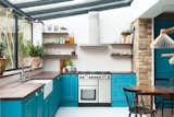
Cluroe and Whitehead are drawn to lilac, deep coral, and pistachio shades for 2020, but blue is a past favorite that still looks fresh.
What's the best finish for each of those colors, and why?
Newman: For "First Light," I think a satin finish would work particularly well. It has a hint of pink that still works as a neutral, and the sheen from a satin finish would make that more apparent. And for all the greens I mentioned, a satin finish is best, too. If you're going to use color, make it stand out.
Cluroe: We love the bold extremes of either a full glossy lacquer or a true matte, so I would say to play with the contrast of both. For example, you could choose a matte finish on the outside of a cabinet and a high-gloss or lacquered finish on the inside in the same color. That would really make your kitchen look and feel unique.
Shop the Look
"Be brave and follow your heart when it comes to cabinetry colors," Whitehead says. "If you love it, it will last."
Which complementary colors and materials would work well for each of the colors you mentioned?
Newman: Black marble with lacquered brass fixtures and hardware complement the muted hue of "First Light" well. "Caldwell Green" should be paired with black hardware and white quartzite counters for a sleek finish, while "Vapor Trails" would look classic with polished nickel accessories and white marble.
Whitehead: The warmth of bare wood works beautifully with the natural shades of pistachio and lilac, or you could try to play against their vibe with black steel metalwork. With the coral, we love to mix it with pale blue shades.
Related Reading:
Here Are the 10 Interior Design Trends That Will Rule 2020
Two Experts Weigh in on the Best Way to Use Behr’s Color of the Year in Your Kitchen or Bathroom
How to Make Your Powder Room Look Absolutely Dynamite, According to the Experts
Published
Last Updated
Fill up on the Latest in Kitchen Design
Discover inspired kitchens and get design advice for the heart of your home.