Friday Finds 1.22.2010
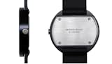
Aaron: Uniform Wares Watches
I've been mulling over putting together a slideshow of a handful of rather cool design watches, but I want to share this one by way of a teaser. Utterly simple in form, and really not too pricey at $145, I've become enamored of Uniform Wares' handsome octet of unisex wristwatches. For some reason black and white look best to me, though a splash of color is easily had as well. I also like some of the new stuff over at Tsovet, but these are even simpler still. The essence of a watch, I'd say. Nice stuff indeed.
Michele: Puppy Cam
Having all things K9 on the brain, I was delighted to see that the Shiba Inu Puppy Cam had been revived. Called "Puppies 2: Electric Boogaloo," the puppy cam aims its lens on a litter of five Shiba Inu babes (two girls and three boys), born just about a week ago. Watching them squirm, sleep atop each other, and play with their mama reminds me that sometimes my favorite design is teh cute dzign.
Kathryn: TeuxDeux

I started this week with a stop into Tina Roth Eisenberg's blog (we know her. we love her), wherein I discovered a sweet little Web-app that she's developed with the folks at FictiveKin. TeuxDeux is a brilliantly simple to-do list, smartly designed, insanely easy, and accessible anywhere. A lovely thing to look at the 30 or so times a day that I have this week. Love it! This has saved loads of time for me already, with which I can now browse the gorgeously updated HBO site. It's what all video sites should aspire to.


Sarah: Nice Stuff and Chocolate
Sometimes the only thing you can bring yourself to do on a Friday at the end of a week of uncommonly incessant rain and accompanying darkness is look at pretty pictures. So even if you don't read Norwegian, you will probably enjoy a long scroll through Fine Ting Og Sjokolade ("Nice Stuff and Chocolate"—thanks, Google Translate). On this blog, the author features gorgeous photo after gorgeous photo of envy-inducing interiors and graphic design, with a Nancy Sinatra video thrown in for good measure.
Jordan: Fickle Flickers
Fickle Flickers has posted an amazing collection of couture currency origami, taking standard banknotes from all over the world and giving the leaders on the bills a brand new look with some seriously skilled folding. I wish they posted a how-to as well, although George and Abe might not be so useful in the vending machine after wearing their jaunty headgear for a while. via Design Aside
Sam: Pan Am's Helvetica Dreamtime

In this Internet age of ours almost every day we stumble across something beautiful but are left with little choice other than to say to ourselves "that's cool," and click onward. That's in part what fascinated me about this blog post by Frederico Duarte regarding the research that went into this recent Eye Magazine article. Captivated by a little-known series of minimalist posters made during a attempted rebranding of Pan Am Airlines in the early 1970s, Duarte documents the circuitous path on which his design research led him. The research itself was part of Steven Heller's D-Crit class, which is nicknamed the "no google class" for reasons that should seem obvious. The story itself is as fascinating as the designs are captivating. There are a lot of lessons here, and to me, they seem mostly to center on placing value in things that most of us no longer have the time or energy to place value in—thoughtful research, the value of storytelling, and digging beyond the artifice of design.
Amanda: Crayola's Color Chronology Chart
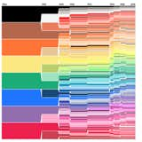
I was not a fastidious child by any strech of the imagination, and though I dearly loved to draw and color, my Crayons, colored pencils and markers usually met a husk-and-nubbin fate, uncapped and dried-out in the graveyard crannies of my room. So I always felt a mingled sense of awe and jealousy when I happened upon my more meticulous schoolmates' collections of Crayons, wherein each perfectly pointed color stood at attention within a pristine box. That familiar feeling came flooding back this week when I clicked on this carefully plotted chart by Weather Sealed, who took the time to synthesize Crayola's history of colors and flow it into a gorgeously rendered image that illustrates the progression of hues from 1903 to today.

Image by Rachel Rabhan. Courtesy Core77.
Miyoko: Urban Movement Design's Olympic Bus Shelters, Benches, and Bike Racks
We've been busy researching and reporting about universal design these last few months in anticipation for our "Universal Design 101" article (which will be published in our March 2010 issue, so stay tuned!). This week, Core77 highlighted the work of Urban Movement Design, a New York City–based firm (a combination of Pedestrian Studio and Inform Design) whose work focuses on creating architecture and design that is informed by human movement and meant to improve our health. For the 2010 Olympics, where the best athletes of the world will meet next month, the firm designed bus shelters, benches, and bike racks that offer a place to stretch and get in some activity that is also accessible to all. I'm hopefully heading up to Whistler in a few weeks and can't wait to check these out in person.
Published
Last Updated
Get the Dwell Newsletter
Be the first to see our latest home tours, design news, and more.