
We are excited to announce that the upcoming January / February 2017 issue will present an updated look to the magazine, including new typefaces, more custom illustrations, reinvigorated pacing, new departments, and longer features. We can't wait to share it with you.
Typography is of great importance to Dwell's visual history and identity, and the first building block of this redesign came in the guise of two new typefaces selected by Design director Rob Hewitt: "When we were choosing new typefaces, it was important that they were practical and utilitarian while having their own individual character in keeping with the spirit of Dwell."
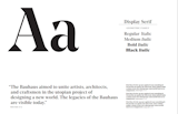
One of two new typefaces, Noe, which appears here, is grounded in the Bauhaus school of thought, exemplified by its true geometric attributes. It will appear as the running body text and as the predominant display type in the magazine, beginning with the January/February 2017 issue—which will hit newsstands on January 24, 2017.
We'll be continuing the conversation here in the coming weeks, sharing more glimpses of the redesign elements and exploring the thinking that went behind the changes. We hope you'll join us in conversation, and of course we hope you like the updated look of the magazine.
Published
Get the Dwell Newsletter
Be the first to see our latest home tours, design news, and more.