Designing the Modern World Award

Dwell's Kyle Blue in front of the Modern World Awards exhibit at Dwell on Design.
"In the Modern World" is a section in the magazine that has been there since the magazine’s inception. With such a long-standing inspiration, Kyle’s team designed a simple and elegant icon.
"The form is an 'M' and a 'W' together. We’ve titled it so it looks like a cube. The logo lended itself to what eventually became the award," he says.
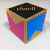
The award took the form of a 4.5" cherry wood cube produced by House Industries. The M and W were each silkscreened on two faces of the wood, while the winning category and winner’s name adorned one face.
"We used natural wood because we didn’t want to do anything that would outshine the products. We really wanted to use a simple, humble material and let the products pop off of that," says Kyle
The result was a logo that seamlessly blends with every Dwell page and an award that every winner would be proud to have on his mantle.
Published
Last Updated
Get the Dwell Newsletter
Be the first to see our latest home tours, design news, and more.