A Bold Blue Extension Caps a Weatherboard Cottage in Melbourne
Creating more space in a small home on a tight, inner-city site with a modest budget is always going to be a challenge. So, when Amber Laing and Yvonne Meng, directors of Circle Studio Architects, were tasked with designing an extension to a weatherboard cottage on a small block in Melbourne, Australia, they decided to extend upwards rather than outwards. The resulting second-floor addition is essentially a structure on stilts that sits on top of the existing home.
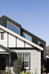
The addition sits over the existing weatherboard cottage. One of the biggest challenges was getting the new roofline to run parallel with the old, as the home had shifted and settled over time.
The young family needed space to accommodate two growing children who had previously shared one of the downstairs bedrooms, but they enjoyed living in the area and didn’t want to move. While they wanted two additional bedrooms, living space, and eventually another bathroom, they didn’t want to encroach on the small backyard on the 260-square-meter (or 2,800-square-foot) site—especially since they had also recently added a puppy to the mix. The solution was to make the most of the existing roof volume by adding another level, much of which sits inside the old roof space. An additional benefit to this approach is that the actual volume of the house, when seen from the street, is not dramatically increased and still fits within the town planning envelope.
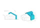
The extension—marked in these drawings in blue—sits on top of the original house, extending the volume upwards.
One of the biggest challenges was uniting the traditional cottage with the new, modern extension. The family liked the character of the neighborhood, and so the new addition is set back from the street, allowing the older home to keep its original frontage.
"The new form wraps around the old, shadowing the roofline of the weatherboard cottage," says Meng. "The old cottage had shifted with time, and the house was out of square. So, much time was spent on site with the builder to line up the extension, and the rafters of the existing house were re-measured and individually reset to marry the new with the old."
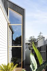
The extension sits over the top of the original weatherboard cottage, only slightly extending the first floor. A floor-to-ceiling window in the extension floods the stairwell with natural light.
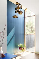
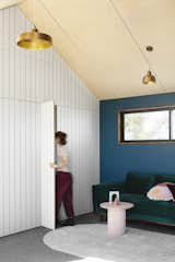
A cluster of Mixin Pendant lights from Australian lighting brand About Space introduces a sense of scale—and "adds bling"—to the double height stairwell. The house is known as Blue House Yarraville thanks to the blue feature walls used to define the extension.
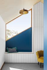
The clients also wanted to keep the original period detailing and the flow of space downstairs. So, the footprint of the extension is minimal at the ground floor, extending to the west for a new stair and to let natural light in through a floor-to-ceiling window, and to the east to accommodate new wardrobes in the downstairs bedrooms.
"The second-floor addition is where all the action is," says Meng. "The steel columns are tucked into the existing walls below in order not to impact on the ground-floor rooms."
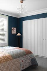
The ground floor was slightly extended to the east to accommodate the addition of built-in wardrobes in the two existing bedrooms.
The extension is clad in charred black timber, which contrasts with the existing weatherboard structure, clearly defining what is new and what is old. The interior is yet another contrast, with bold blue feature walls and brass fittings set against neutral ply ceilings, timber trims, and white joinery. The vibrant blue color was chosen as many of the clients’ early inspiration images had featured richly hued walls.
"The new addition is a bright but minimal canvas for the kids to make their own," says Meng. "The color helps add that playful nature, and the kids chose their own colors for their rooms and window boxes. Color is such a great way to add life to a space, and we wanted the home to be bright and bold."
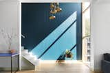
The original home was slightly extended to the west on the ground floor to accommodate a stair leading to the new upper level and a large, floor-to-ceiling window that floods the interior with natural light. The blue paint used in the main areas is Dulux Capital Blue S34C9.
"I’m a huge fan of color being able to change the mood of a space dramatically without expensive materials," says Meng. "In keeping to the modest budget, we also focused on clean, strong forms and made sure to include a few key finishes, like the birch ply ceiling, to make the space feel special."
Shop the Look
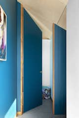
The door leading to one of the children's bedrooms on the upper level. The addition extends completely into the angled roof space to create a sense of volume.
The two new children’s bedrooms feature steel window boxes lined with painted ply, providing a nook in which to sit. Timber screens with a playful and graphic cut-out pattern provide privacy from the street, while still letting natural light into the interior.
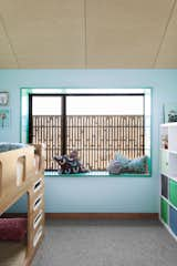
The feature walls in the children’s bedrooms in the upstairs addition are painted using British Paints Waterflow 316.
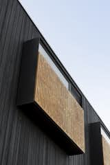
The extension is clad in charred black timber, which contrasts to the lighter, existing weatherboard structure. Graphic timber screens over the windows offer shading and privacy.
In the living room, seating and much-needed storage has been built into the white joinery—which references the weatherboard cladding on the original home. The joinery also conceals doors that lead to a space within the roof cavity that is ready to be transformed into a second bathroom when needed at a later date, essentially future-proofing the home as the family continues to grow. "The initial discussions really focused on being able to get a bathroom up there," says Meng. "Funnily enough, however, that was the part that was left off for Stage Two, as it didn’t make the final budget for this stage."
Bench seating has been built into the joinery in the new living room.
The joinery in the upstairs living room conceals what the kids call "Narnia doors." These doors lead to a space in the roof cavity where a bathroom will be built at a later date.
This new living room is connected to a rooftop deck that sits in a void created by the way the stairs have been configured in an "L-shape" to avoid breaking into the side boundary setbacks. Full-height, glass sliding doors open onto this outdoor space, creating an indoor/outdoor living environment.
The northern windows to the living room, deck, and stairwell are boldly angled, aligning with each other and following the angle of the roofline. The window to the deck sits in a wall that continues the roofline of the addition, and connects the rooftop space to the wider neighborhood by framing the streetscape. "You're high up so you're still somewhat removed," says Meng. "But, you do feel a part of the neighborhood while up there, rather than being tucked away in total privacy."
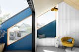
All of the northern windows follow the angle of the existing roofline and align with each other between the living room, deck, and stairwell. Full-height glass sliding doors open directly from the living room onto the deck.
The stairs were placed in an "L-shape" to avoid breaking into the side boundary setbacks. This created a void on the roof which made the perfect place to put in a rooftop deck.
Blue House Yarraville—as Circle Studio has aptly named the project—is a successful study in how bold color and strong, minimal forms can be used to create a home with plenty of personality on a modest budget. "At the end of the day, we managed to achieve something bright and fun on a small site," says Meng. "That in itself feels pretty good."
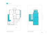
Ground floor plan and first floor plan of Blue House Yarraville by Circle Studio Architects. The area of work has been marked in blue.
Related Reading: 12 Mullet Homes in Melbourne That Are Modern in the Back
Project Credits:
Architect of Record: Circle Studio Architects / @circlestudio_architects
Builder: Carland Constructions
Structural Engineer: Vivid Civil Engineers
Cabinetry Design: Finewood Designer Kitchens
Stylist: Paige Anderson
Published
Last Updated
Get the Renovations Newsletter
From warehouse conversions to rehabbed midcentury gems, to expert advice and budget breakdowns, the renovation newsletter serves up the inspiration you need to tackle your next project.