An Expert Painter Explains How He Pulled Off an Electrifying Interior
Phil Schinman can tell you many stories from his 30-year career as a paint contractor. Color trends have come and gone, but it’s the unique requests that stand out—including the time a client requested a mirror-like finish for their interior walls.
"It took 17 coats of high-gloss metallic paint. My team and I sanded after each coat, repeating the process until the finish was just right." For Schinman, it’s the challenging projects that he enjoys most. And that’s why he is still reveling over the electrifying blue interior of the Hidden House, a Telegraph Hill home he spent months painting in 2019.

A long-time San Francisco resident, Phil Schinman started his own local business, Schinman Painting, in 1992. Today, he mainly works with residential contractors, although his experience includes work for large hotels and historic properties such as several of the world-famous Alamo Square Painted Ladies.
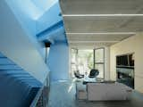
Featured in the March/April issue of Dwell, the Hidden House derives its name from a high-contrast interior concealed behind a relatively subdued facade. "The main goal was to distinguish the vertical zone of the house, with its stair and skylight, from the opposite side," says Zoë Prillinger, who imagined the design along with her partner, Luke Ogrydziak, of the San Francisco-based firm OPA. "We decided to contrast a vivid color with the use of only raw (unpainted) materials in all the living spaces."
"Color is wonderful insofar as it draws one in and provokes a deeply emotional response," says Prillinger. "First, identifying a color with which you are willing to live requires something of a personal journey, and I also think one’s feelings about color change in the process."
To identify the perfect shade of blue Prillinger and the homeowners began by reviewing several standard colors from Benjamin Moore, progressively tweaking combinations of saturation and value in 10% increments. "It was interesting to know the concept relied heavily on the work I was doing," says Schinman. "The juxtaposition of the blue against everything else also emphasized the importance of getting the application just right," he adds.
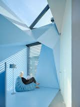
The homeowners, Doug Smith, an entrepreneur, and his wife Lorna, an artist, wanted an experimental look and positive atmosphere. "Color is exciting because it really has a life of its own," says Prillinger. "At the scale of architecture, and as light changes throughout the day and year, it does things one doesn’t anticipate. One has to be a little brave to entertain trying to harness it in the first place, and open to, or better yet, excited by some amount of uncertainty."
Yet, the process of painting the home was the challenge Schinman savored. "It was very, very difficult," he says. "Two thirds of any job is prep work. We masked off the entire section while the other contractors walked around us." Schinman and his team worked on the blue section for approximately two and a half months, meticulously applying multiple coats of primer and paint to the drywall, as well as the metal staircase and railing. "My company is small, so the whole focus is on customer service and on making sure a job is done right, however long it takes," he adds.
"If a client doesn’t say they love a color, I'm not going to paint it. If they simply say, ‘I can live with it,’ I don’t think that is good enough."—Phil Schinman
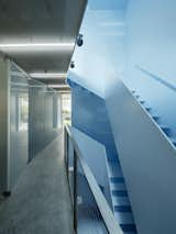
"We wanted to heighten the experience of climbing the stairs by making it into an immersive space unto itself," says Prillinger. "Most people think of modern architecture and associate with it a very neutral palette of white, grays, and black. At OPA, we really hate the tyranny of received ideas, and when we recognize one, it becomes a strong provocation to take a different direction. Color is alluring, and also very pleasurable."
Shop the Look
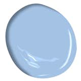
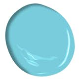
"We started by selecting a few preferred color chips of blues," explains Prillinger. "A primary consideration was the level of saturation—how much color versus the grayscale. We knew that if we undersaturated the color, we wouldn’t get the variation in different light that we wanted and the color would be ‘dead.’ But too much saturation and would feel crude and out-of-control in this setting. In the end, we landed on a slightly cool custom color we call Lorna Blue after one of the clients."
Schinman worked with San Francisco supplier Creative Paint to mix the nearly 400 gallons required for the job. "When I work on projects like the Hidden House, I need to trust my supplier. I only worked with one person in the paint shop, and he mixed every single gallon." While the process can be difficult at times, Schinman doesn’t mind. "It's relatively easy to paint a Victorian, an interior edge, or things like that; but the really challenging projects, the ones unlike anything done before, that’s what I really enjoy."
For more information about Benjamin Moore products, please visit their website.
Project Credits:
Architecture: OPA / @opa_architects
General Contractors: Forsythe General Contractors / @forsythegc_sf
Engineering: Buro Happold Engineering / @buro_happold
Cabinetry Fabrication: Shada / @shada_design
Planting Plan: Delphine Huetz
Paint Contractor: Phil Schinman
Paint Supplier: Creative Paint
Published
Last Updated
Get the Pro Newsletter
What’s new in the design world? Stay up to date with our essential dispatches for design professionals.