A Look at Klaus Wittkugel, East Germany's Most Prolific Graphic Designer
On view through February 21 at Manhattan’s pocket-sized P! gallery, OST UND oder WEST (East and/or West) presents an abbreviated survey of the late graphic designer Klaus Wittkugel (1910–1985), who, despite a prolific four-decade career spanning logos, posters, publications, posters, and architectural signage, has remained largely unknown to Western audiences. The probable cause for Wittkugel’s enduring anonymity: his longtime client and home, the East German Socialist state. Though ostensibly focused on the graphic output of a single individual, the show provides a lens into the visual history of the Cold War, and more broadly, the complex political nature of producing work under the commission of a client. The last is a context not entirely unfamiliar to graphic designers practicing even today, Socialist state–client or not.
Inside, the exhibition is filled with contextual displays, interspersed with brief, historicizing texts. In a clever twist of mise en abyme, a slideshow of Wittkugel’s spatial designs, mixed with present-day screenshots showing 3D-models of the gallery's exhibition design, project onto a wall-size reproduction of East Berlin’s iconic Kino International cinema, for which Wittkugel designed the facade signage.
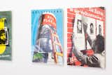
"One aspect of Klaus Wittkugel's work that always fascinated me is his self-reflexivity about the process and labor of graphic design," says Prem Krishnamurthy, director of the experimental New York gallery P!, where he has just mounted a show of works by the East German designer. He first began researching Wittkugel eight years ago, when he discovered a book of his work in a Boston bookstore. "In the poster Das Plakat from 1954, an exhibition of international posters is communicated through an image of a poster column, just moments after someone has finished wheat-pasting it. The 1957 political poster on the right calls for citizens to run for a local council. It represents a scene-within-a-scene: a worker putting up posters for other candidates as the poster itself."
The sense of nested, underlying messages—indication of the designer’s authorial agency, despite working for a Socialist state—permeates the surrounding works on display. The age-old opposition between client and designer was pronounced even in Wittkugel’s lifetime, and in some cases, cleverly winked at. Among the meta works is Wittkugel's 1954 Das Plakat (The Poster), a flyer for a poster exhibition that self-reflexively depicts a freshly wheat-pasted poster column with a ladder propped upon it.
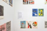
Krishnamurthy on Wittkugel's poster designs: "The exhibition includes a tight selection of posters from the 1950s through 1970s, only a small portion of what Klaus Wittkugel designed over his long career. Wittkugel's exhibition designs for his retrospectives in the 1960s and 1970s were often jam-packed with work: walls full of posters, boards featuring exhibition designs, logos, and more. He even went so far as to include a full-scale reproduction of one of his exhibition displays in a later retrospective. I've taken a more sparing approach to installation, but also refer to his strategies through specific conceptual elements: For example, by presenting my curatorial wall text about posters in exactly the same manner as the other posters."
Out front, an actual poster column protrudes from the gallery’s storefront entrance. Neatly pasted onto its surface is a checkerboard of alternating flyer designs—a mix of works by Wittkugel, and some by Anton Stankowski (1906–1998), his West German contemporary, and in many ways, his foil. In what sounds a little Spy vs. Spy, the two designers studied under the same teacher in Essen, each going on to relatively successful advertising careers in the 1930s; after World War II, Wittkugel began working for the East German state, and in the West, Stankowski took up projects with large corporate clients. The pairing, as it were, carries over at the OSMOS project space in the East Village, where Cay Sophie Rabinowitz has installed a show on Stankowski as a companion to the presentation at P!.
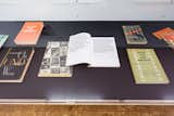
"It's hard to pick out any one aspect out of Klaus Wittkugel's work, as he was so prolific and wide-ranging, but I do find his book covers from the late 1940s and early 1950s extremely striking. They are mostly abstract compositions of typography and form, which translate the content of the book into a mini-artwork. If we had more space, we would have presented much more of this type of work," says Krishnamurthy, who is himself a graphic designer and devised the show's exhibition displays. "Here, too, I've inserted my curatorial voice into the form that it's describing—as an open book spread—lest anyone think that this is an unmediated or neutral presentation."
Browse the slideshow above for commentary from Prem Krishnamurthy, director and curator of P!, on issues of circumstance, intention, and agency as seen in select pieces of Wittkugel’s work.
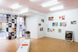
"P! is a particular space: a so-called 'white cube' designed by architects Leong Leong, but with its own peculiarities. Furthermore, the ceiling is a site-specific work, Pink Ceiling, 2015, by Julie Ault and Martin Beck. The layout of the gallery is a quirky open-square, which is reimagined for nearly ever show," says Krishnamurthy, who launched the gallery in 2012. "I've used the space to its full advantage here, as I'm fitting a mini-retrospective of almost 50 years of Klaus Wittkugel's work into a single room. Each section of the show is installed in its own manner; they coexist in the space together. Out in the front of the gallery, I've 'exaggerated' an existing column by sheathing it with a cardboard column that is wheat-pasted with reproductions of works by both Klaus Wittkugel and his West German contemporary, Anton Stankowski. It's a comparative treatment, an art historical argument, in physical form."
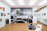
"This view captures the main installation gesture of the exhibition and also what's visible from street level. In his exhibition designs, Klaus Wittkugel often used large-scale panoramas of the city to transport the viewer into another context," notes Krishnamurthy. "Here, I'm turning this display strategy back onto Wittkugel himself. This is an image of Kino International, a modern film theater in East Berlin from 1963. For this architectural icon, Wittkugel designed the signage, including a clever spot to hang a poster as the 'space' in the name of the building. Here, I've blown up a historical image of the façade to room-sized proportions and gone one step further: one of Wittkugel's most striking posters, Das Kalte Herz [The Cold Heart], 1950, hangs framed on top of the building. An analogue slide projector plays a loop of selected images from Wittkugel's exhibition designs, retrospective exhibitions, and architectural commissions, interspersed with contemporary images of those same locations and screenshots of the digital models of my exhibition design that mirror these historical views. Installed as if the spectators out front are watching the projection, this display is the centerpiece of the show."

As part of the exhibition display, Krishnamurthy installed a large poster column that protrudes from the gallery's storefront facade. "Klaus Wittkugel believed in the street as a primary context for graphic design: a large portion of his work consisted of posters, meant to catch your eye while walking. As P! is in Chinatown and has a very public presence, I decided to extend this gesture and make it a key feature of the exhibition," he says. "In Berlin, you still see a lot of Littfasssäulen, a distinctive and typical kind of poster column. Together with Cay Sophie Rabinowitz, curator of the parallel exhibition on Anton Stankowski at OSMOS, I conceived an installation that would display reproductions of work by the two Cold War designers together. There is also a second poster column at OSMOS, which is the 'umbilical cord' between these two otherwise independent exhibitions. The installation echoes Wittkugel's own approach to his retrospective exhibition in 1961, when he covered the poster columns in the city with a selection of his past work, along with the posters announcing the show. Artist Maayan Strauss had the brilliant idea of making the poster column 'break out; of the gallery, so that it seems to literally cross over a border. Wittkugel's first job was as a window-dresser, so it's an appropriate homage to have this kind of attention paid to the storefront window."
Published
Last Updated
Get the Dwell Newsletter
Be the first to see our latest home tours, design news, and more.