A Few Words with Lars: An Interview on Beller
Sean Hanratty: Hello, Lars – really excited to get to speak with you today and happy that you have joined the Austere family! I guess to sort of jump right in, could you tell us a bit about yourself?
Lars Fjetland: Hi Sean! Well, I’m 31 years old and I’m currently living and working in Bergen, Norway. I grew up in a small town on the southwest coast of Norway called Randaberg. It was the perfect place for me to explore nature and nurture my fascination for materials. I have always felt a need to create, and this led me to leave business school to initiate my design studies at Bergen Academy of Art and Design.
I founded my studio Beller design a year prior to completing my bachelor’s degree in furniture and spatial design, and am now working as a full time designer. I’m a "one-man band" by choice, as I found this to be the optimal way of working.
SH: Congratulations on your recent award in design from Elle Décor (Norway) have these accolades had a positive effect on you career and aided in you getting your design concepts out into the world?
LF: Thanks, and yes I think this award has had a very positive effect on my career. The Elle Décor family is one of the real heavy hitters in the industry, and it was a big honour for me to receive the title of "Designer of the Year 2013". (Elle Décor Norway)
Some of my work is really clean, simple and toned down. This can prove to be a challenge in a world where everyone is screaming for attention.
To gain recognition from Elle Décor Norway and BoBedre is both encouraging and essential. It motivates me to stay true to my philosophy and to continue to follow my chosen path.
I noticed a certain escalation in the numbers of inquiries after the award, especially from Norwegian manufacturers. I guess that this could indicate that an award functions as a kind of "seal of approval".
SH: Yes, it is a little bit more then just a pat on the back I imagine!
SH: Okay, now on to some questions about your actual designs. With the Pomme object it is clearly a multi-use piece with the ability to be used as a pincushion, a toy, or just as a paperweight. Were you considering the objects utility when you designed this or was this more an exercise in utilizing the materials at hand? Could you also speak to the collaboration with Discipline and how it came about?
LF: Renato Preti, CEO of Discipline presented me with the design-brief of developing a product solely consisting of pieces of leftover cork and leather. I have always enjoyed a real challenge, so I immediately started to work on several possible ideas and solutions. The size and shape of the off cuts set the basis for form and function.
The apple shape was a perfect fit with the redundant cork pieces, and the leather off cuts proved to be a good match aesthetically and functionally. It was important for me to create something that felt right, and had some weight to it. The weight gives it the needed stability, and a feeling of value. The shape is something everyone can relate to – it’s friendly, familiar and adds a sort of warmth to any interior.
It was important for me to make it into a multi functional object, which could suit a range of different purposes. I see it as an eco friendly toy, a thumbtack holder, a letterpress and a decorative object. I want the end user to decide what it is and how to use it, as I’m sure Pomme has a range of applications that I haven’t event thought of yet.
SH: How heavy and dense is the Pomme, would it hurt if I threw it at you?
LF: Lets try and see next time I’m in LA.
SH: Ha! Do not worry…we are insured.
SH: I am pretty fascinated by the Equal Chair. You are combing natural and industrial materials here, but the chair still overwhelmingly feels like it is made of natural materials. What were your interests in adding cast aluminum to the chair? Were you subverting traditional notions of harmony? Or was there a larger reason for it?
LF: The starting point for this design was a to construct a classic and durable chair by combining cast aluminum and ash wood. I wanted it to have a distinct Scandinavian look, without making it a thing of the past. The chair is extremely simplistic, consisting of an absolute minimum of parts. It’s representing a modern and informal interpretation of the chair.
The concept was meant to explore the potential and possibilities in uniting the "past" and "present".
The wood represents the "past" while the aluminum represents the "present". The aluminum part is highly technical, while the wooden parts are processed using an ancient technique. I love these contrasts, as both parts are completely dependent on the others to work.
I’m extremely focused on tactile experiences, and I find the rough and cold surface of the aluminum to be an excellent match with the warmth and softness of the ash wood. I can imagine it being fitted into a classic eatery where it would endure the stress and beatings of everyday use. My favorite quality of this design is its informal and straightforward (no nonsense) attitude.
SH: The Cloche Lamp seems to convey or be inspired by elements of the Bauhaus School is this intentional in any way?
LF: You might be partly right here, as I find a lot of inspiration in the works that represent the Bauhaus movement. This being said, Cloche was never meant to be a sort of throwback or celebration of this era in particular. I was more focused on reinventing some of the grace and "formal sophistication" you’ll find in lighting from the first half of the 20th century in general. The floral theme has for instance its route in Art Nouveau and the formal language has a touch of Art Deco to it.
SH: Solid is another piece that has you joining two different but harmonious sets of philosophies. You are combing Japanese traditions and Norwegian aesthetics, what drew you to this union?
LF: Some of the keywords for that particular project were simplicity, refinement and harmony. I new that I wanted to work with a combination of stone and wood, and it was through investigating these materials I got to learn more about traditional Japanese architecture. The formal language of the table is influenced by the traditional Torii gates that mark the transition from the profane to the sacred in Japanese Shinto-temples – gathering inspiration from its wood- and stone-based construction.
I guess the Nordic/Norwegian aspect of the project manifests itself in the choice of materials and construction principles. Both marble and ash wood are "native" materials in Norway, and a toned down minimalism has always been one of the key features of Scandinavian design.
The joint that connects the crossbeam with the legs/stringers of the table is a traditional half-n-half joint found in old log cabins building throughout Norway.
SH: Your Drifted series comes from a fairly interesting story from you visiting Øygarden, outside of Bergen. As I understand it you were inspired by all of the materials floating ashore. Could you elaborate on this story? Were you there for a particular reason?
LF: I was actually visiting this particular site while doing research for a land art/architectural project I was working on. I spent about three days studying the landscape, its fauna and the climate, and it was here I found the essence and soul of the Drifted project. The sea has a way of bringing floating objects ashore, and some of these objects were driftwood and old fishing net floats in cork. I was intrigued with the way the sea and weather had treated these materials. The wood had been bleached and scoured by the ocean, and the old nets ground to unrecognizable shapes. These textures, shapes and material set the basis for the Drifted series.
SH: It also makes me think this is a bit of polluted area….is that the case?
LF: The area is not polluted at all, but the harsh climate does makes it a bit unattractive for the average Joe.
SH: I was only joking about the pollution. We all know Norway is quite clean!
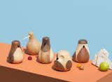
SH: Now I want to turn to something really fun, which are the wooden sculptures you made from re-purposed wood. The Re-Turned birds look very reminiscent of objects from the golden age of the mid-century modern period. Did you look to these archival designs for inspiration?
LF: I can honestly say that they were created without looking too much back in time. Studying the things that already exist can easily become a limitation, rather than inspiration. It would perhaps have tempted me to mimic the proven and accepted techniques and styles, instead of developing my own concept, shapes and methods. I’m a collector, so I know what’s out there. The basis for this project was initially about learning how to operate the wooden lathe, and not about creating a commercial product.
SH: Why a bird? Is there something that made you think of this form and animal? In a way you are sort of creating birds from leftover materials, much like birds make their homes/nests from scraps as well. Did that play a part in your decision?
LF: It’s a rather tricky question, but I guess it derives from my lifelong fascination of these creatures. They are in our back gardens, hanging outside our kitchen windows, in the park and at the bus stop. These creatures are literally following us through life. They also happen to be extremely diverse, iconic, cute and weird, which makes them really fun and inspiring to work with.
My initial idea was to use the different structures and color variations of wood to create features like wings, feathers and other details to bring a variety of different species of birds to life. It took me several months to figure it out, but it was without a doubt worth all the hard work.
SH: Is your practice for object design similar to that of your furniture design?
LF: Every design process is unique in its own way, but the set of design tools are usually the same. The complexity of an object isn’t necessary an indicator of how much time and energy you’ll end up spending on the process.
SH: As is common in Scandinavian design, a real attentiveness to nature and treating materials very consciously and ethically appears to be fundamental to your practice. Do you find in this day and age for that consciousness to part of a designers obligation?
LF: I believe that my "nothing gets wasted" approach to craft and production is something that is quite typical for Norway and Scandinavia. The often rough and harsh conditions in these parts of the world forced our ancestors to make the most out of the scarce resources they were lucky enough to come over. This is especially evident in the traditional craftsmanship of the Sami people, who still live and thrive in the northern parts of Norway.
I personally believe that it’s our responsibility as designers to create products that are solving problems without creating new ones. We need to be thinking about the entire lifecycle of a product, from cradle to grave. This should be the rule, rather than the exception.
Beller objects will be available soon on the Austere web site, but for now please come and visit our Downtown LA Store and Showroom to view in person (please do let me know if the Pomme does indeed inflict pain if thrown at you).
Text by Sean Hanratty
Published
Last Updated
Get the Dwell Newsletter
Be the first to see our latest home tours, design news, and more.