Ready for a Fresh Coat of Paint? Check Out the Top Colors of 2024
When it comes to small home updates that make a big impact, a quick coat of paint takes the cake. By simply changing the color of your walls, you can make a space feel bigger or smaller, brighter or cozier, more soothing or invigorating—so if you’re craving a refresh, painting is a great place to start.
Finding an on-trend hue that speaks to you can be a task in and of itself, so paint brands look to the future as they announce their upcoming colors of the year. In 2023 their picks ranged from creamy whites and cozy beiges to vivid pinks and oranges—and next year’s palette is shaping up to be just as eclectic. Read on for a first look at the colors of 2024 according to trend forecasters, interior designers, and industry experts.
Pantone: Peach Fuzz

Pantone’s 2024 color of the year is Peach Fuzz, an orangey-pink hue that’s meant to create a feeling of ease.
The team behind Pantone’s selection for its 2024 color of the year wanted to set its choice firmly within the present moment. "We were focusing on how we were living, and how our priorities have taken on new meaning," says the company’s vice president, Laurie Pressman.
Collectively, these decision-makers saw that two things were true: This era is filled with turmoil, and that presented a need for "moments of respite," Pressman says. They hoped to select a shade that would make someone feel at ease, while simultaneously providing the energy they’d need to foster a sense of community. "It needed to be a color whose welcoming embrace conveyed a message of compassion and empathy," Pressman continues.
While that’s a lot of pressure to put on a pick, Pantone has long been in the business of using colors to elicit a specific mood. So, in the name of deep-breath solidarity, the 2024 Color of the Year is Peach Fuzz, a poppy orange-pink that speaks to its namesake with an almost childlike appeal. This doesn’t quite resemble the hue of the actual stone fruit, but instead looks more like the color of a peach-flavored Popsicle that’s best eaten on a lazy summer day.

A collaboration with Ruggable features Peach Fuzz in one of its rugs.
"Peach Fuzz reflects days that seem simpler, but at the same time, can also display a more contemporary ambiance," Pressman says. "It’s a color with a gentle lightness and an airy presence."
Pressman recommends using Peach Fuzz to create the feeling of being in a sanctuary, whether it’s used to create a cocoon-like entryway to welcome guests or in a bathroom to flatter all skin tones. The company also makes it easy to see how this shade works within a number of palettes, ranging from truly bright and irreverent to more subdued and classic. In any iteration, Pantone is not shying away from color—and that’s to help others do the same. "It’s a versatile hue that promotes feelings of gentle warmth," Pressman says.
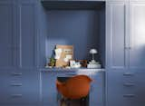
Benjamin Moore: Blue Nova
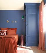
Benjamin Moore’s 2024 color of the year, Blue Nova, is meant to evoke the excitement of travel.
When the folks at Benjamin Moore began discussing this year’s leading shade, their minds were wandering far from home. "For 2024, we found inspiration through travel—both near and far—breaking out of our ordinary routine to experience something new and capturing color moments along the way," says Hannah Yeo, the company’s color marketing and development manager.
Travel has an interesting way of broadening perspectives, of course, and cultivating a viewpoint that may comfortably balance between two spheres. That’s reflected in Benjamin Moore’s ultimate choice of Blue Nova, which it describes as a mid-tone shade with a red undercurrent.
The company sees it as a flexible color that can cover a room or punch up cabinetry.
"Because of its depth and contemplative quality, Blue Nova is a great fit for a study or home office," Yeo continues. "Blue Nova is also an excellent choice for a bedroom, living room, kitchen cabinetry, or an island because of its flexibility. Lastly, it offers an opportunity to be creative, whether that’s using the hue on a ceiling, color drenching a room entirely, or going bold by pairing with a complementary color such as topaz, an earthy terra-cotta."
Blue Nova is the star player in a 10-paint palette that goes from light to dark and warm to cool. The team hopes that it brings a sense of adventure to a home, while also making it feel welcoming. "This palette allows homeowners to explore contrasting color combinations that fit their personal style," Yeo says.
Dunn Edwards: Skipping Stones
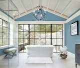
Dunn Edwards 2024 color of the year, a blue shade called Skipping Stones, belongs to a nature-inspired collection that’s meant to provide a connection with the outdoors.
It seems as if the decision-makers behind Dunn Edwards’ pick understand the modern world’s dilemma: Getting immersed in nature sounds so lovely, but the endless push to use technology indoors wins out far too often. The next best thing? Bringing nature inside.
"This year’s color of the year is pulled from the New Dawn palette," says the brand’s color expert, DeMing Carpenter. "It’s a nature-inspired collection that creates space for quiet reflection amidst the chaos of an always-on world. It’s made up of ethereal pastels, misted mid-tones with a touch of grittiness, grounded earth shades, and colors that feel like glimmering sunlight."

Dunn Edwards sees the color being used for singular moments, as with this front door, or to cover entire rooms.
The standout shade is Skipping Stones, which Carpenter says is "a serene and steely blue that represents the tranquility people are desiring." She notes that after a decade of neutral gray, the team’s research found that people are craving color in a way that promotes a serene connection to the outdoors. "Skipping Stones is calming and energizing at the same time, taking cues from the sea with undertones of green and gray," Carpenter adds. "It feels like a daydream, and can add a sense of mystery and thoughtfulness to any space."
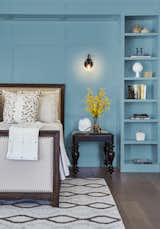
Skipping stones has green and gray undertones, "taking cues from the sea," says DeMing Carpenter, Dunn Edward’s color expert.
She recommends covering an entire room in it, including the ceiling, or going for a monochrome look with complementary blues like Smoke and Mirrors or Stone Silver. "You can also opt for this blue on kitchen cabinets for a modern and elegant makeover that reaches beyond the white and navy trends we’ve seen in the past."
Behr: Cracked Pepper
Cracked Pepper is Behr’s 2024 color of the year. While forecasting the hue, the firm found that 74 percent of Americans would consider painting a room a dark color.
Behr’s 2024 pick marks a dramatic shift from last year’s Blank Canvas (a creamy shade of white). With the feel of a dark river rock that’s been placed in the sun, Cracked Pepper can read lighter or darker depending on its surroundings.
The company suggests using this shade in a wide range of applications—from kitchen cabinets and living room walls to bathroom vanities and exteriors—and if you pair Cracked Pepper with Blank Canvas, you'll have a neutral space with a slight edge.

Cracked Pepper can also be used as an accent, as it is on this kitchen island.
"A soft black like Cracked Pepper evokes a sense of confidence and individuality that we want all of our customers to feel after completing a project," says Jodi Allen, global chief marketing officer at Behr.

A black paint job makes this room feel bold and dramatic.
"As we look into 2024, creating a sense of comfort and belonging will continue to drive design decisions—but now, as life returns to its more familiar rhythms, it’s time to allow our senses to come alive," says Erika Woelfel, vice president of color and creative services at Behr. Cracked Pepper is available exclusively at the Home Depot in a range of finishes.
HGTV Home by Sherwin Williams: Persimmon
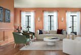
Persimmon walls makes this living room feel light and bright.
HGTV Home by Sherwin Williams (which is sold exclusively at Lowe’s) picked Persimmon as its 2024 color of the year. This peach-meets-terra-cotta hue can feel either grounded and earthy or glamorous and decadent depending on how it’s used—and the brand selected the shade for that easy flexibility.

Persimmon, the HGTV Home color of the year, can be an accent or all-over shade.
"We are transitioning into a time where the home has become a way for personal expression, and we’re bringing in shades that are unexpected and comforting," says Ashley Banbury, color marketing manager. "Persimmon is derived from nature for a sense of comfort, but also gives you the ability to craft a space that feels unique."
The color is part of the brand’s Renewed Comfort Color Collection, which includes the merlot-esque Dark Auburn, the deep-in-the-forest Oakmoss, and the carefree Friendly Yellow. There are neutrals in the mix as well, like a sandy tan and crisp white.

The brand’s Renewed Comfort Color Collection is composed of shades that work well together. Pictured here is Oakmoss.
Banbury says that Persimmon would look beautiful on a front door or covering an entire bedroom. She recommends creating balance by using a brighter shade as the main hue in a room but softening it with neutral ones—or vice versa. "If Persimmon is on the walls, then Pearly White can be an accent," she says. "But if Persimmon is used on a kitchen island, then white can go on the walls. These colors work together so that you can also feel free to take risks."
Related Reading:
Planning to Paint? Consider This Your "2023 Color of the Year" Cheat Sheet
Published
Last Updated
Get the Pro Newsletter
What’s new in the design world? Stay up to date with our essential dispatches for design professionals.